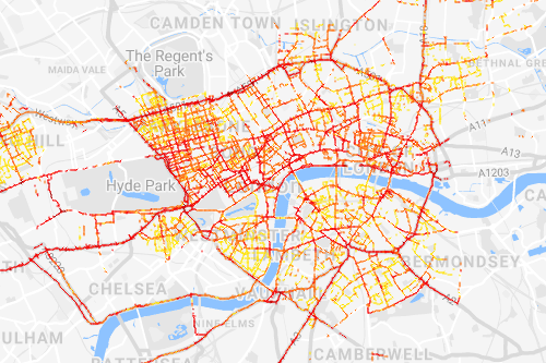
Working on the Breathe London project
My responsibility at EDF Europe has been to bring to life the data produced
by the Breathe London project; a cutting edge, multi-year air quality monitoring
campaign in London, which used both car-mounted, mobile and low-cost, stationary sensors.
This document
lists pieces of work that I contributed analyses and visualisations
to, some of which were covered by major new outlets, including The
Guardian,
BBC News, and
Evening Standard.
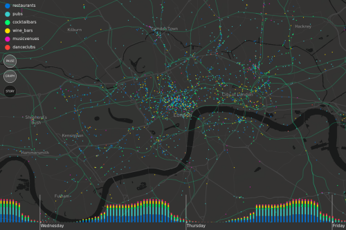
London Nightlife Visualisation
An interactive and animated map visualisation created to show the rhythms of London's nightlife.
The data was gathered using Python scripts to query the Yelp API
to find business locations and opening hours. The visualisation was created using the javascript libraries
P5.js and Mappa.js,
as well as Mapbox.
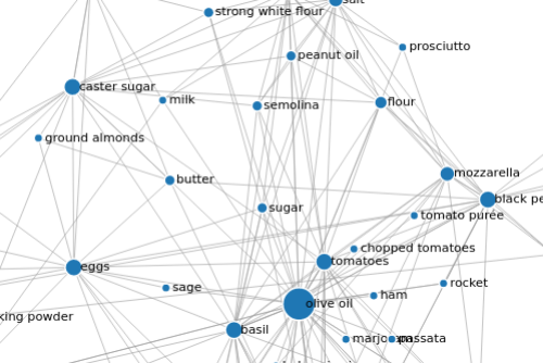
Italian recipe ingredients
A bit of an experiment into web scraping and visualisation using a
topic of significant interest to me: cooking.
First, I used the Python package Beautiful Soup
to scrape every ingredient from any recipe classed as Italian on the BBC food website.
Then, after a bit of analysis used D3 to create
a network style visualisation to show how common ingredients are, and what other
ingredients they tend to appear alongside.
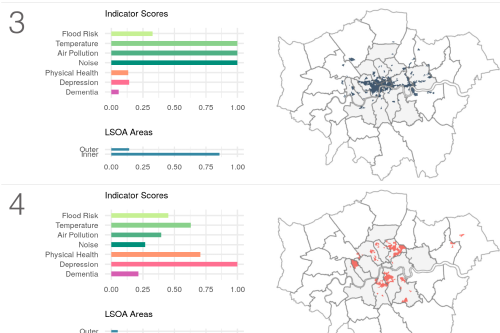
Masters Dissertation
A research project focussed on creating a measure of demand for Green Infrastructure
in London, completed in collaboration with
Westminster City Council. The
github page has
an executive summary as well as links to the full pdf, code, data and all
the final visualisations produced.
Created using a wide variety of tools, but largely R for analysis, charts
and maps, as well as LaTeX
for producing the final pdf document.
Bridget Riley Print Generator
A very quick and fun experiment to create a digital imitation of a Bridget Riley print, after being inspired by the
incredible exhibition at the Southbank Centre in January.
Made using P5.js.
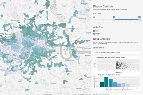
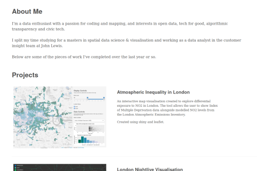
Atmospheric Inequality in London
An interactive map visualisation created to explore differential exposure
to NO2 in London. The tool allows the user to show Index of Multiple Deprivation data alongside
modelled NO2 levels from the London Atmospheric Emissions Inventory.
Created using R Shiny and
Leaflet.
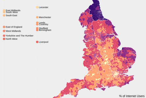
Mapping Tools Comparison
A masters assignment to explore a dataset using two different applications.
I used data from the Oxford Internet Institute on digital inequality in England to
compare the relative advantages and disadvantages of creating maps in R and QGIS.
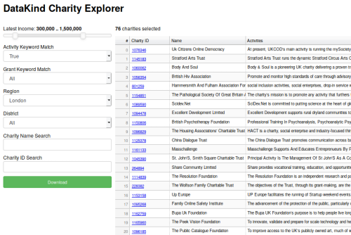
DataKind Charity Search
DataKind are a charity who help social change organisations to improve their impact using
data science. I built a tool to help them find suitable organisations to work with.
It runs keyword matching on open data from the Charity Commission and 360 Giving
to identify charities with aims that match DataKind's objectives and allows the user to explore
the results in an interactive dashboard. Created with Python and Bokeh.
This Website
A very simple web development project to showcase some of my work and play around
with Tachyons.